An agency-wide conversion rate is a useful headline and a poor diagnosis. It tells you whether things are broadly working, and it hides the creators, channels and offers that need attention.
This article is about reading that rate properly: what goes into it, what it leaves out, why it moves for reasons that have nothing to do with performance, and the three numbers worth more than the headline. Examples either come from the jeruo demo workspace (24 creators, 482,291 visitors and 71,420 leads over 90 days, all illustrative) or are clearly hypothetical.
What the rate measures
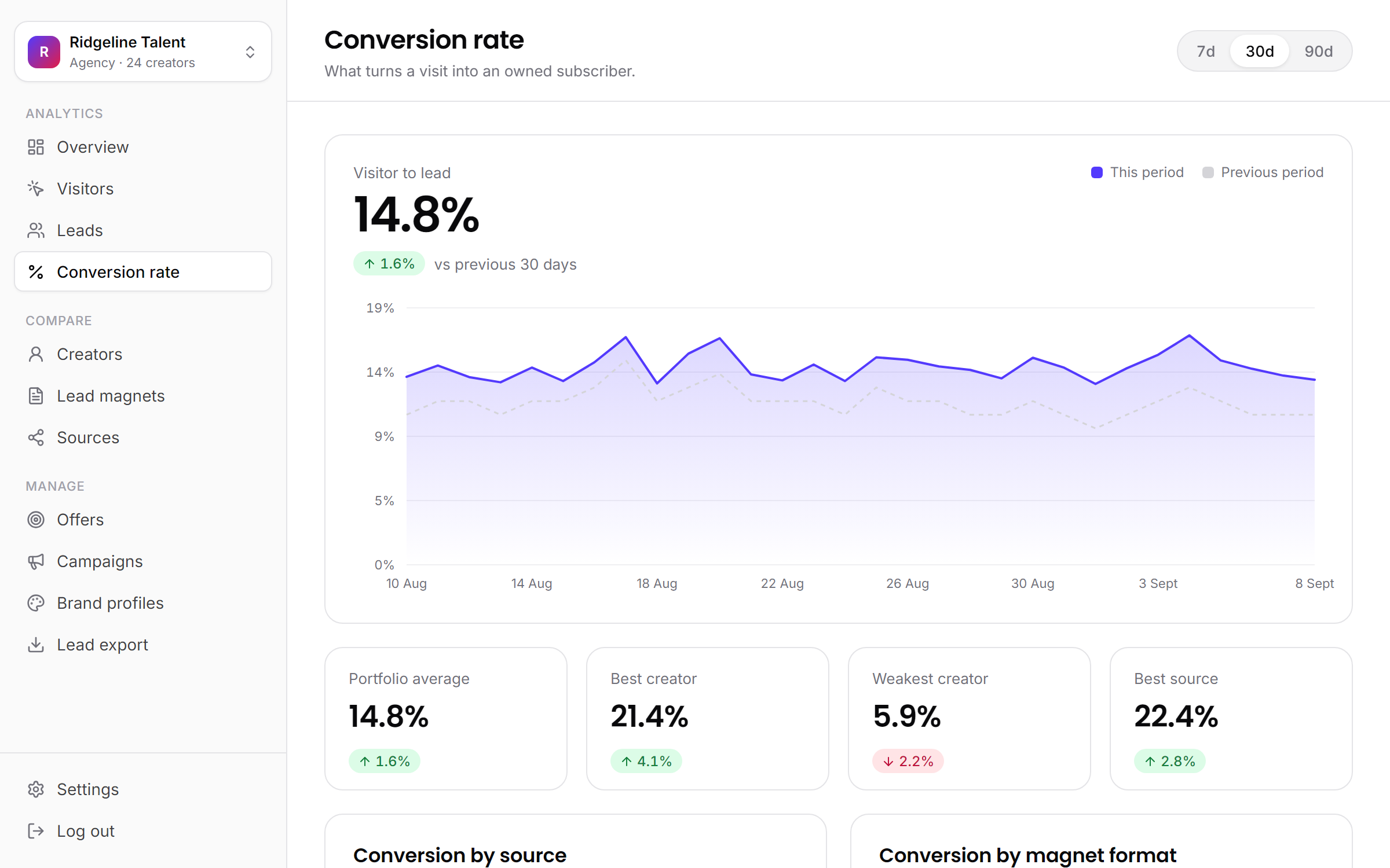
The definition is simple. A visitor is a person who opened a lead page. A lead is a visitor who submitted their name and email with consent. The visit-to-lead rate is leads divided by visitors. In the demo workspace, 71,420 leads from 482,291 visitors is 14.8%.
Two details matter before you read anything into it.
First, the agency-wide figure is a weighted average: total leads over total visitors, not the simple average of each creator's rate. A creator with 60,000 visitors moves it ten times as much as one with 6,000. When your biggest creators convert differently from your smallest, the two kinds of average tell different stories.
Second, the rate starts at the page. Everything that happens before the click sits outside it.
What it leaves out
- Reach. A creator who gets 500 people to the page and converts 25% of them produced 125 leads. One who gets 20,000 there at 10% produced 2,000. The rate cannot tell you which is the bigger contribution.
- Intent before the click. A mention that explains exactly what the viewer will get sends fewer, warmer visitors. A vague "link in bio" sends more curious ones. The first shows a higher rate even when it captures fewer leads.
- Lead quality. A lead who never opens an email counts the same as one who buys a course. Quality shows up later, in your email platform and in sales. On the Agency plan and up, revenue attribution in jeruo follows a lead to the offer they bought, which is the closest thing to a quality measure.
Why the average moves on its own
Because the headline is weighted by traffic, it shifts whenever the mix of traffic shifts, even when nobody's performance changes. A hypothetical two-creator agency shows the effect:
| June visitors | June leads | July visitors | July leads | Visit to lead | |
|---|---|---|---|---|---|
| Creator X | 10,000 | 800 | 30,000 | 2,400 | 8.0% both months |
| Creator Y | 10,000 | 2,000 | 10,000 | 2,000 | 20.0% both months |
| Agency | 20,000 | 2,800 | 40,000 | 4,400 | 14.0%, then 11.0% |
Creator X had a video take off in July and tripled their traffic. Neither creator's rate moved. Total leads rose 57%. And the agency-wide rate fell three points, because most of July's visitors came from the creator who converts less.
Anyone reading only the headline would call July a bad month. It was the best month of the year. The reverse happens too: when a high-traffic, low-converting creator takes a month off, the headline climbs while total leads fall. A rising rate can hide a falling total, so read the rate next to the lead count, never on its own.
Look at the spread
The useful information is in the distribution, not the middle. Rank creators by rate, then sources, then lead magnets, and look at the distance between the top and the bottom.
In the demo workspace, the five sources run from 7.4% (TikTok) to 22.4% (QR codes) around a 14.8% headline, a threefold spread. The five creators profiled in the rented audience problem alone run from 5.9% to 21.3%. The headline describes almost none of them. Where the gaps are is where the work is.
Two habits make a ranking useful.
Weight by traffic. A creator at 6% with 40,000 visitors matters far more than one at 4% with 300. Sort by rate, then check visitors before deciding who goes to the top of the list.
Ignore small samples. A rate built on a few dozen visitors is mostly noise, and new lead magnets and new placements often sit at the extremes of a ranking for exactly that reason.
How much one lead moves the rate
With 50 visitors, each lead is worth 2 percentage points. With 500, it is worth 0.2. With 5,000, it is worth 0.02. Before you compare two rates, check that both rest on enough visitors that a handful of leads cannot swing them.
Three better numbers
The headline is the summary. These three are the diagnosis.
1. Leads per thousand views
This joins the two halves of the funnel that the rate splits apart: how many viewers clicked, and how many visitors signed up. Views come from each platform's own analytics; visitors and leads come from your lead pages.
It also catches a trap the rate falls into. Say two videos each get 200,000 views. The first mentions the checklist mid-video and sends 2,400 people to the page; 480 sign up, a 20% rate and 2.4 leads per thousand views. The second leaves the link at the bottom of the description; only 800 people find it, but 200 of them sign up, a 25% rate and 1.0 lead per thousand views. The higher rate produced fewer than half the leads, because only the most determined viewers ever reached the page.
2. Conversion by source
Different sources bring different intent, so compare each source with its own history rather than ranking sources against each other. TikTok at 7.4% in the demo workspace is not failing next to QR codes at 22.4%; it sends a different kind of visitor. TikTok sliding from 7.4% to 5% over two months would be a real signal.
This only works if every placement has its own tracked link with a consistent source and label. A loose naming habit splits one channel into three rows, and the comparison falls apart. A UTM naming convention keeps it clean across a roster.
3. Conversion by lead magnet format
Format is the number most likely to hold from one creator to the next. In the demo workspace, a checklist converts at 24.8% and an ebook at 6.3%, a gap of nearly four times. A creator can do little about who watches them, but the agency can change the offer next week.
Read this one across the whole portfolio, not per creator. Any single creator has too few lead magnets to say much, while a roster of twenty has enough to show which formats keep winning. The conversion screen in jeruo breaks the rate down by format across every creator, alongside source and date range.
Acting on it
Numbers only help if they change next month's work. The goal is to turn the weakest converter into a brief.
Start by picking the creator where a better rate is worth the most: visitors multiplied by the gap between their rate and the roster's typical rate. A creator 8 points below with 30,000 visitors a month is 2,400 leads of headroom. One 10 points below with 2,000 visitors is 200. (How to raise that with a big creator who is used to good news is covered in why your biggest creator is probably not your best converter.)
Then read the breakdowns to find which layer is weak:
- Low on every source and every placement: the offer. The audience does not want what the page promises.
- Low on one source, normal elsewhere: that placement. The link is hard to find, or the mention does not explain what the viewer gets.
- Fine last period, low this one: something changed. Check the link, the page headline and the lead magnet file before anything else.
Finally, write the brief in four lines:
- The creator, the rate now and the traffic behind it.
- The layer you think is weak, and the breakdown that says so.
- The one change you will make.
- The date you will compare the result against the previous period.
One change at a time, or the comparison cannot tell you which change worked.
The short version
- The visit-to-lead rate measures the offer and the page. It says nothing about reach, intent before the click or lead quality.
- The agency-wide rate is weighted by traffic, so it moves when the mix shifts even if nobody's performance changes.
- Rank creators, sources and lead magnets, weight by traffic, and ignore rates built on a few dozen visitors.
- Track leads per thousand views, conversion by source and conversion by format, and turn the biggest gap into next month's brief.